Bringing the world of coffee to life for an award-winning roastery
Comics for branding
The fast growth of the coffee sector has led to a proliferation of small, independent roasteries. It’s from this competition that Rotterdam-based roastery Ripsnorter wanted to stand out.
‘Ripsnorter’, explained founder Zjevaun, is Australian slang for “something extraordinary“. As a roastery, Ripsnorter sees no need for compromise between Dutch attention-to-detail and Australian laid-back charm and informality.
Ripsnorter approached us for a logo redesign and some artwork for their line of retail coffees, sold in-store at their Rotterdam cafe. As a recent entry into the market, Ripsnorter’s existing visual identity had been improvised and the brand hadn’t yet found its own visual “voice”. Through conversations, the project grew in scope to encompass a full root-and-branch rebrand of Ripsnorter’s entire visual identity touching everything from product packaging, to the full spectrum of digital and print collateral.
Product design for Ripsnorter’s standard line of retail coffee
Product design for Ripsnorter’s premium line of speciality coffees
Design collateral for in-store and email marketing
Website visuals
Content for social media
Project Execution
Using storytelling through comics as the guiding principle for a rebrand
Visual Identity
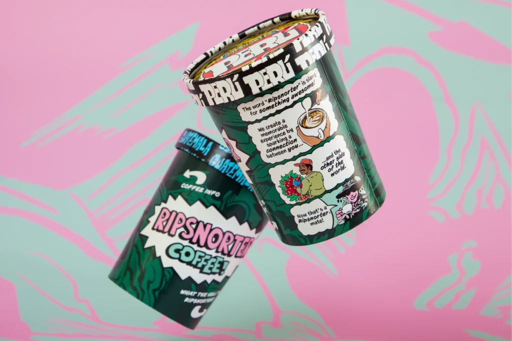
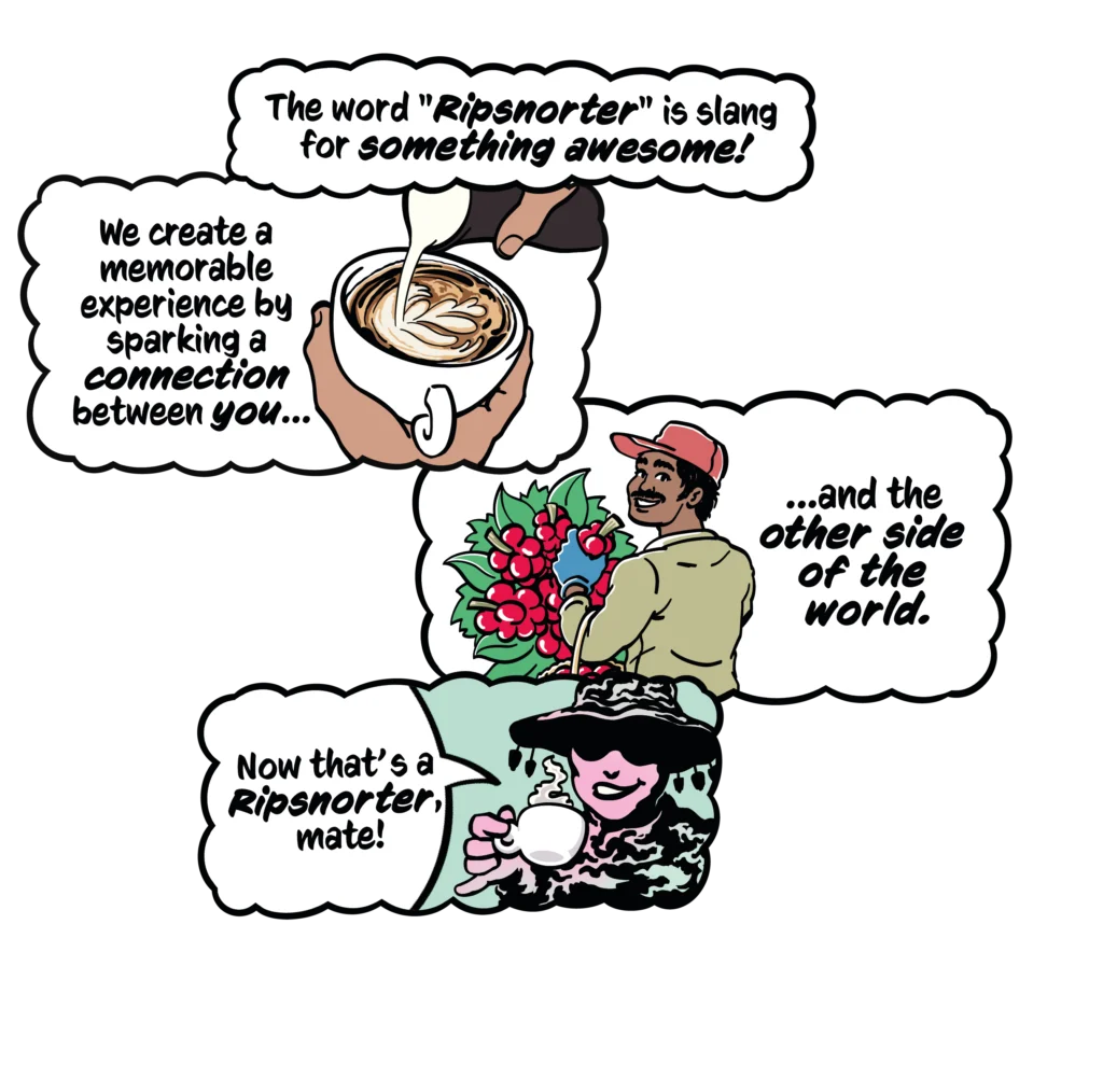
The visual identity we developed for Ripsnorter is influenced by “golden-era” comics. It’s typified by swirling ink textures, hand-drawn typography, and punchy bright colours. Together these elements come together to form a vocabulary that allows for rich storytelling, whilst importantly maintaining a strong visual impact on the shelf.
The chunky lettering of the logo embodies the playful and approachable tone of the brand. This is reinforced in collateral through the use of comic-style word balloons and informal, comic-dialogue style copy.
Product Packaging
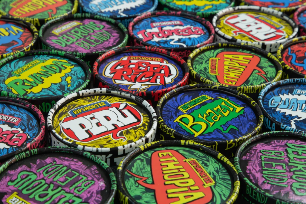
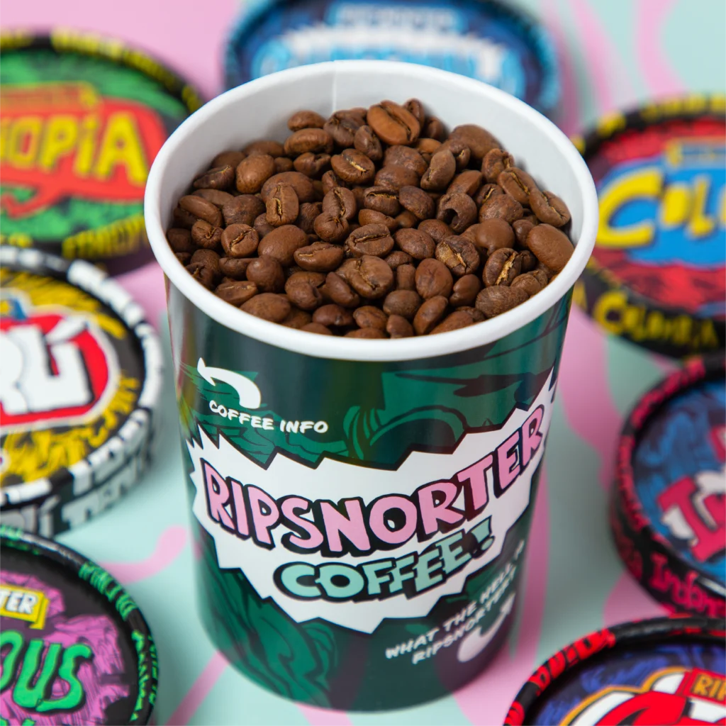
Standard retail coffee is typically sold in box-bottom bags. To emphasize the distinctive, mischievous character of Ripsnorter coffees, we designed colourful ice cream tubs, to make the experience of opening the coffee tub a moment of fun for the consumer. The colour and type of each unique lid are influenced by the character of the coffee’s country of origin.
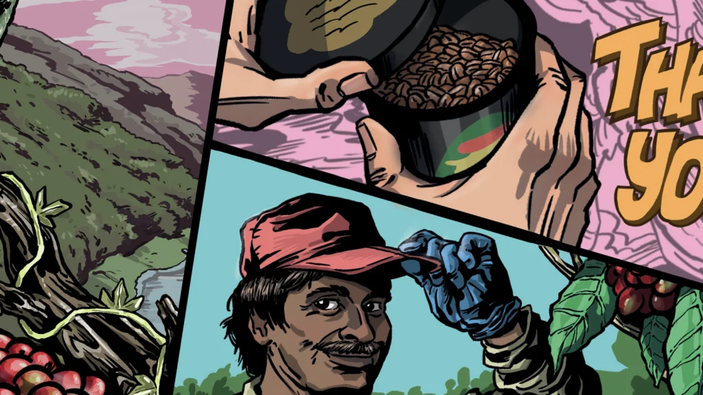
Storytelling
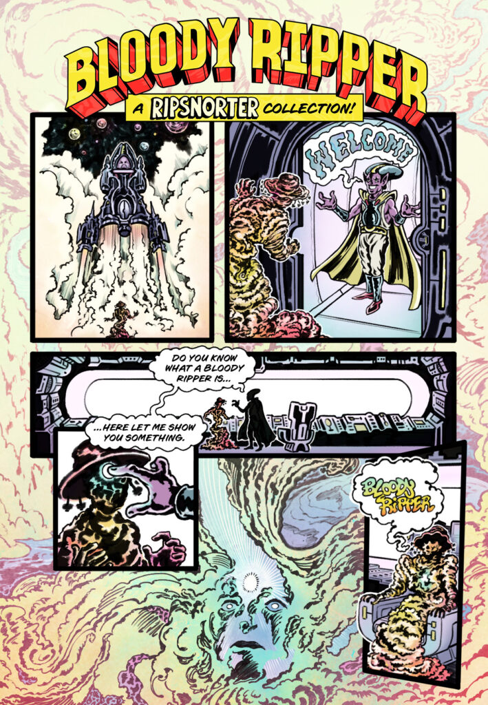
Like fine wines, premium coffees utilise varied artisanal practices of farming and processing that lend themselves especially well to storytelling.
For Ripsnorter’s Bloody Ripper collection of premium coffee, we wanted customers to feel a sense of anticipation and excitement, to convey the sense of being taken on a journey. We designed a series of sci-fi and fantasy themed wraparound comics for the packaging.
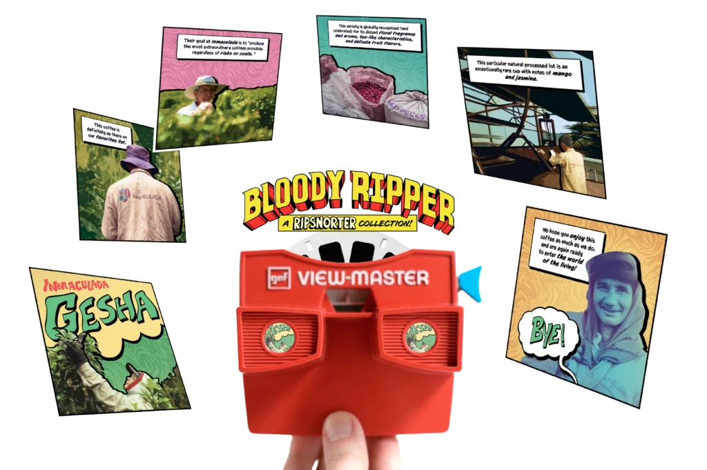
View Masters
We made a series of slides to be viewed using a vintage View-Master®. Customers ordering a Bloody Ripper coffee in-store will receive the View-Master through which they can follow the story of each coffee’s farming and processing.
Your story,
your way
Do you have an idea for an awesome project for your brand? — let’s bring it to life together!